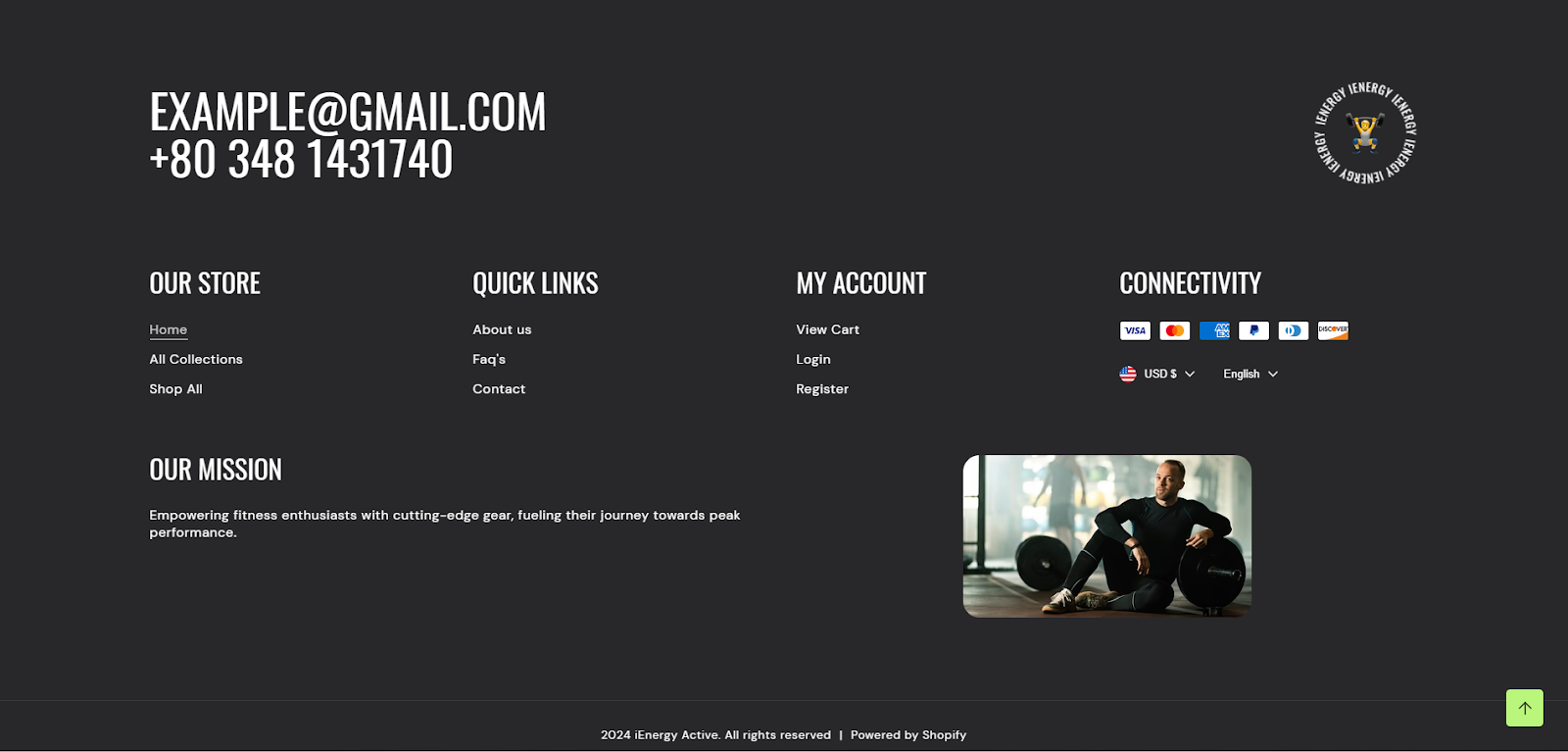
Footer
What is the footer section?
A footer section in a theme refers to the bottom part of a webpage or document layout. It typically contains information that is consistent across multiple pages, such as copyright notices, contact information, links to important pages (like a privacy policy or terms of service), social media icons, and sometimes a brief site map or navigation menu. The footer is important for providing users with essential information and navigation options, especially when they reach the end of a page or website. It helps in enhancing user experience and providing a cohesive design throughout the entire website.
How to set up the footer section?
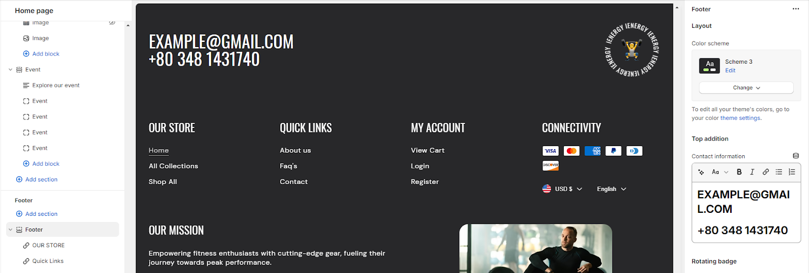
1. Start by navigating to the footer section within the home page settings. You'll find customization options located on the right side of the screen.
2. Choose the color scheme for your footer from the four available options.
3. After setting the color scheme, add the contact information which you wish to display in your footer section.
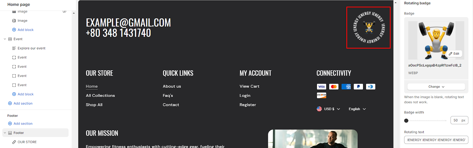
4. To set up the rotating badge, first, upload images and input rotating text in the designated field. Additionally, you can customize the badge width using the slider.
5. Keep in mind that if the image field is left blank, the rotating text won't be displayed.
6. Include any additional text in the field you want to display.
7. Enable the "Show powered by Shopify" link option and policy links.
8. To add store policies, navigate to your policy settings.
9. Next, you can choose to enable the "Follow on Shop" option. Note that for customers to follow your store on the Shop app from your storefront, Shop Pay must be enabled.
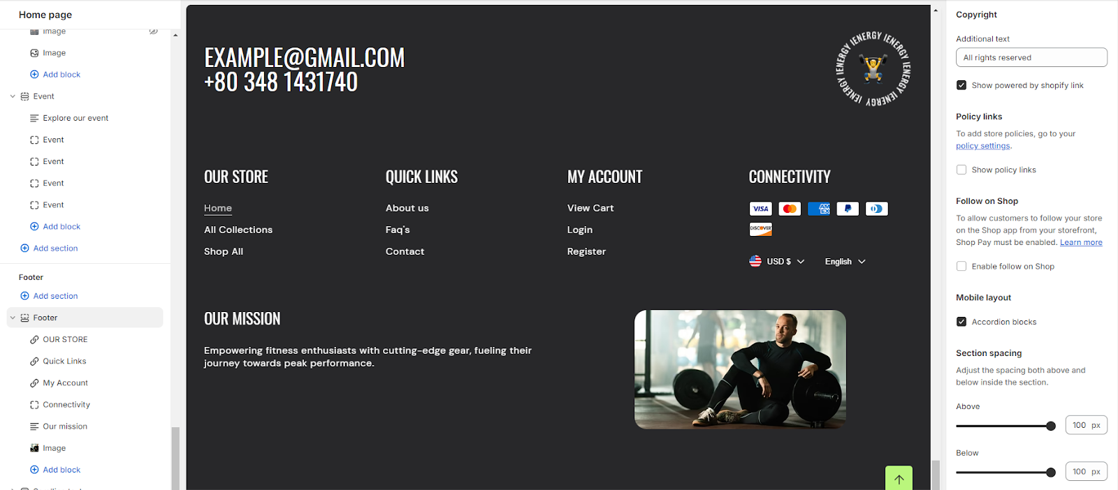
10. Adjacent to that option is the ability to manage the mobile layout by enabling accordion blocks.
11. Finally, fine-tune the spacing above and below the section using the section spacing slider.
Add Blocks
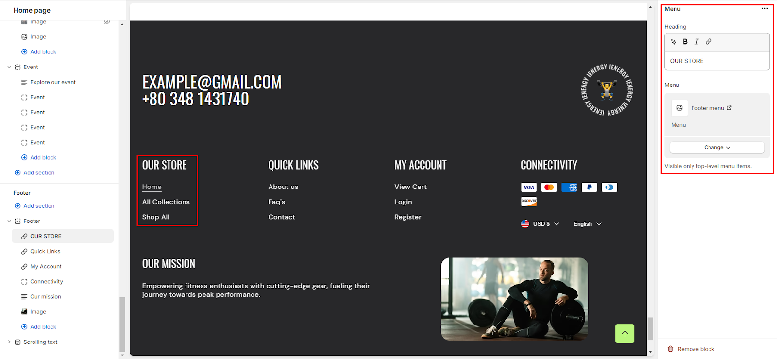
1. In the footer section, you have four blocks available: Menu, Connectivity, Text, and Image. These can be added according to your needs.
2. To add any of these blocks, click on "Add Block" below the footer, where you'll find these four options.
3. When adding the Menu block, customization options will appear on the right side of the screen.
4. Input the heading and select the menu you wish to display from the options provided.
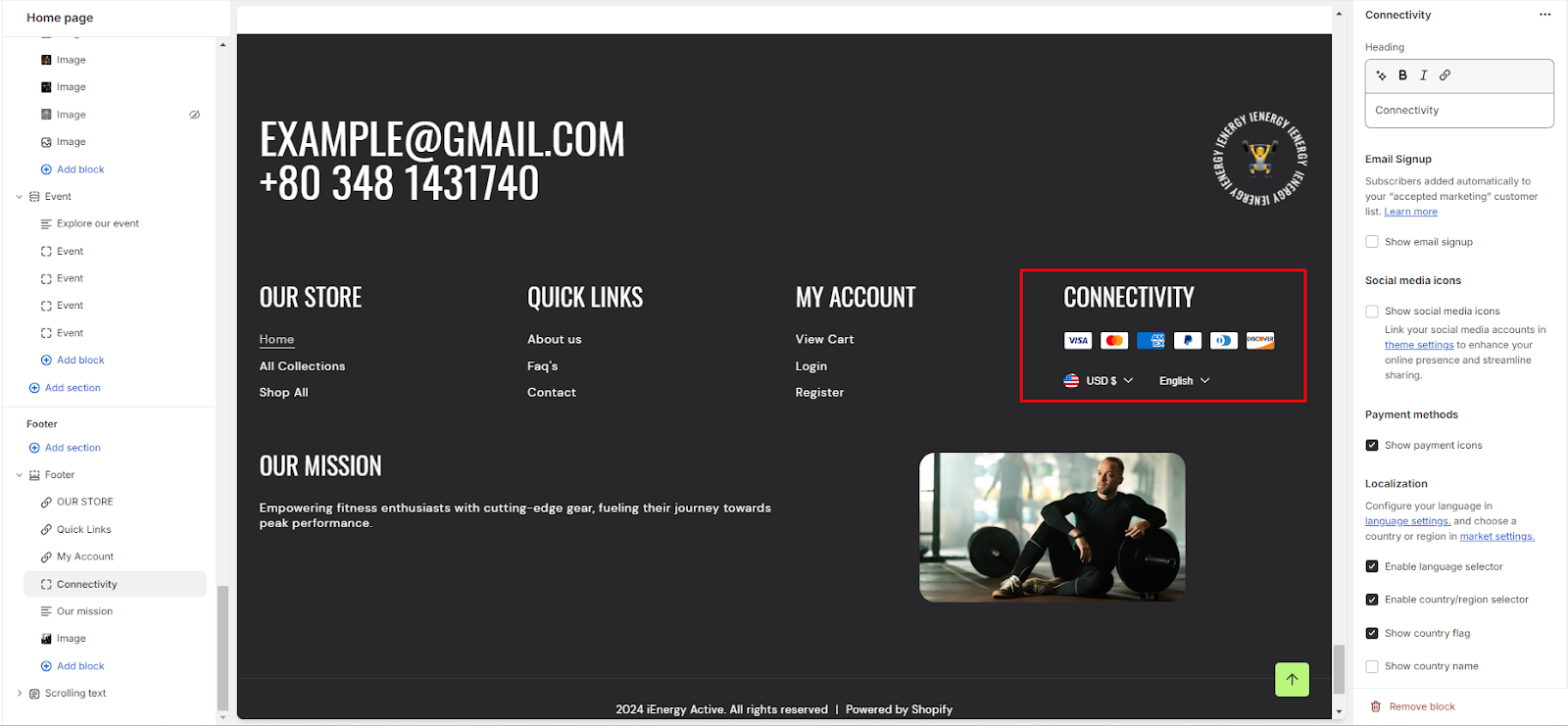
5. Similarly, for the connectivity block, customization options are available on the right side.
6. Begin by adding a heading to the block.
7. Options to enable Email Signup, Social Media Icons, and Show Social Media Icons will appear under the heading.
8. Localization options include enabling the language selector, country/region selector, displaying the country flag, and showing the country name.
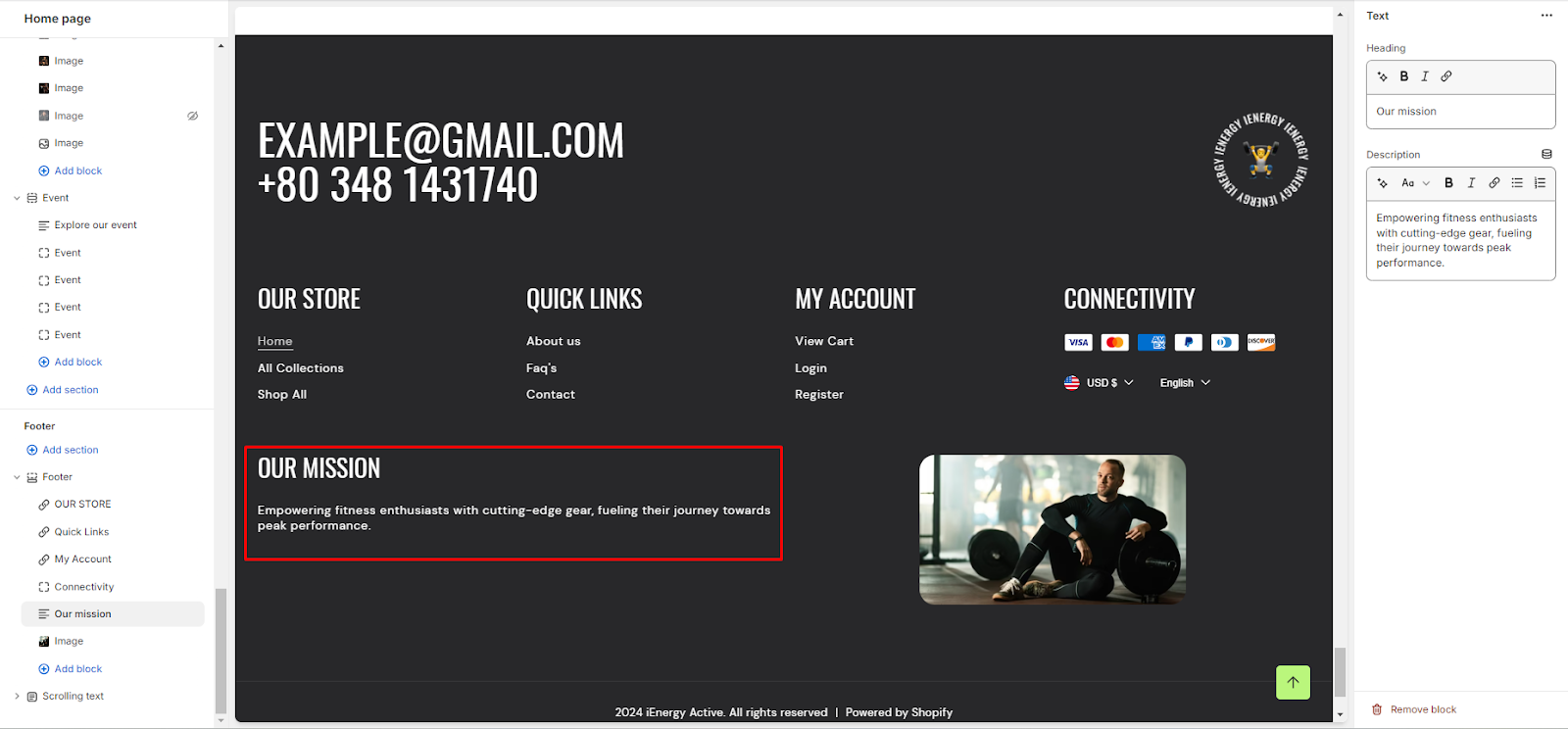
9. The Text block allows you to add a heading and description.
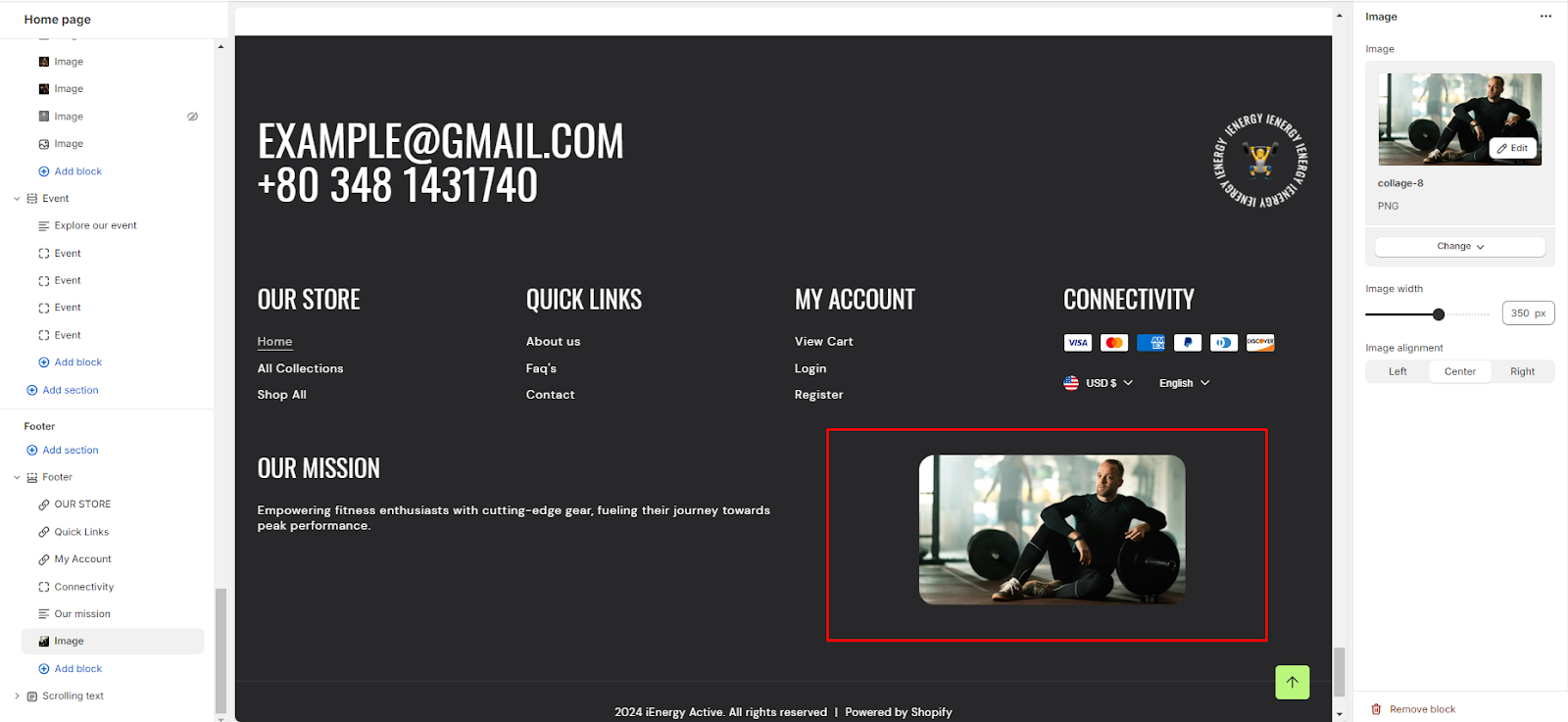
10. Finally, the Image block lets you add an image, manage its width, and adjust its alignment.
Unable to locate the information you need?
Our support team is here to help! Feel free to reach out anytime – we're just a message away and ready to assist you with any questions you may have.