Featured collection
Customize the Featured Collection in a Template
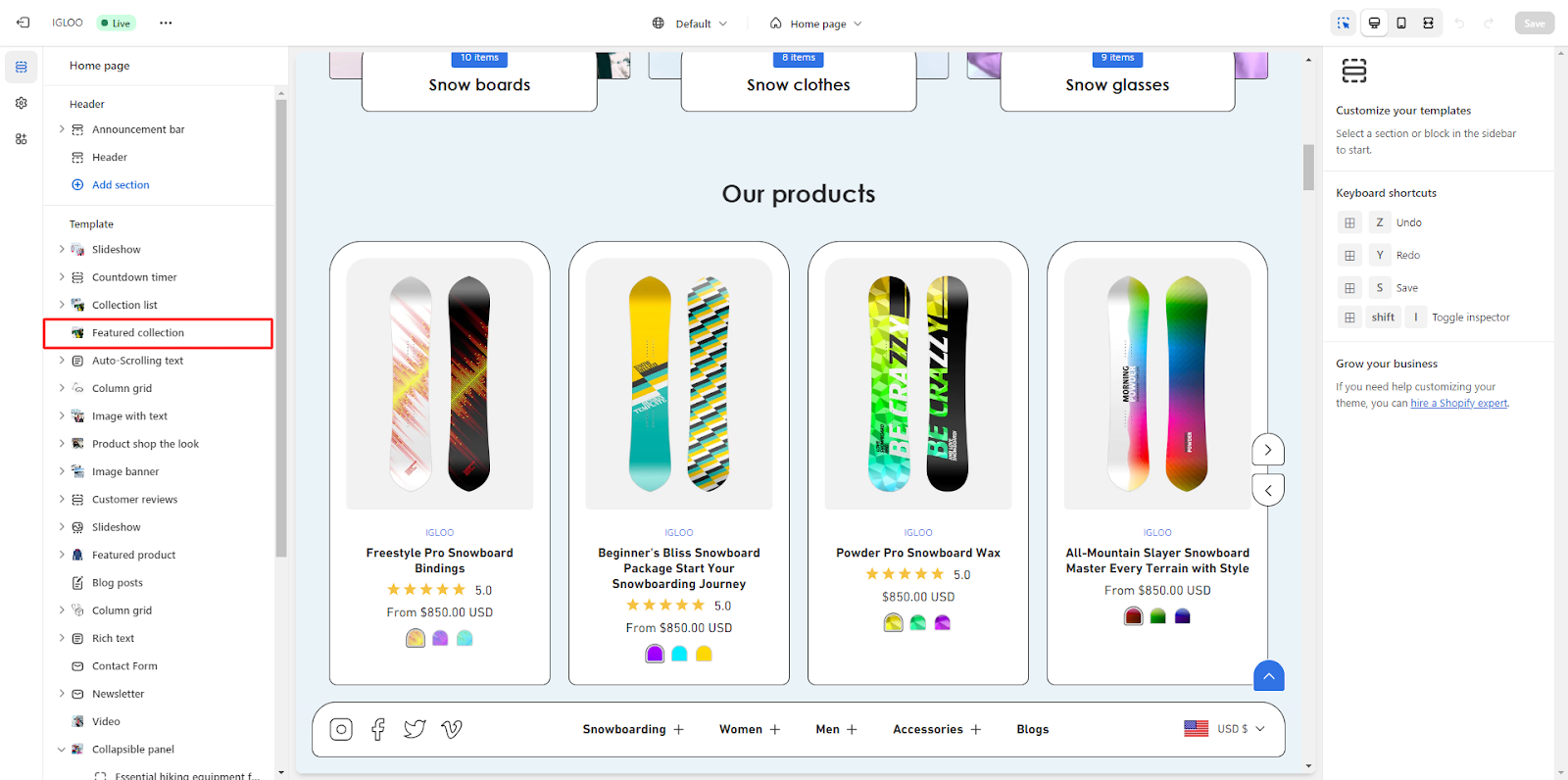
1.Begin by navigating to the "Template" section. Within this segment, you will locate the "Featured Collection" option positioned below the list of collection list.
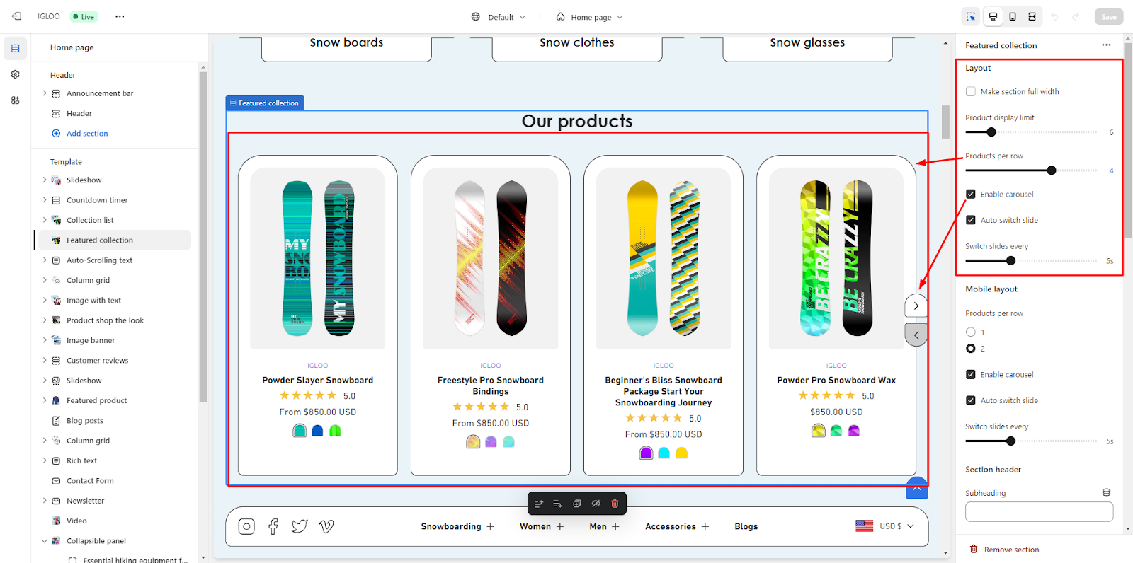
2. Click on the "Featured Collection" option. Upon clicking, you will be presented with the opportunity to personalize the appearance of the "Featured Collection" on the right-hand side.
3. In the "Featured Collection" customization section, you will find options to configure the layout of this section.
Initially, you can opt to make the section full width.
Beneath this, there are 2 range selectors allowing you to specify the maximum number of total products you desire to exhibit, along with the number of products per row.
Within the same section, you will also encounter a checkbox to activate the carousel feature for automated slide switching. If activated, you can designate the interval at which the slides will transition.
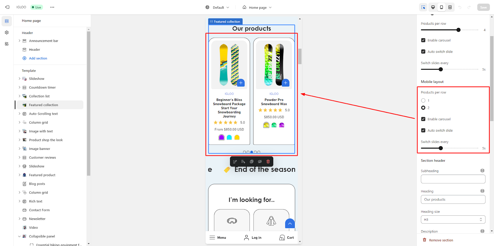
4. Moving forward, you are presented with the capability to adjust the layout specifically for mobile devices.
You can manage the number of collections displayed per row choosing between 1 or 2 collections.
Additionally, you can opt to enable the carousel functionality for the collection list exclusively on mobile devices.
If you decide to enable automatic slide switching on mobile, you can indicate the duration between slide transitions.
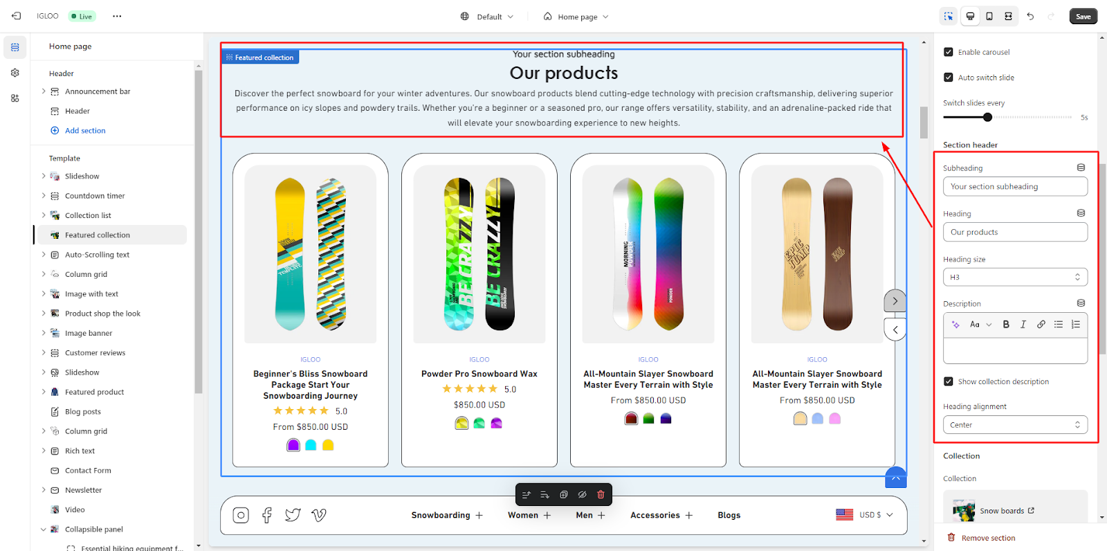
5. Subsequently, the option to modify the section header of the collection list becomes available.
Within this context, you can define the subheading, heading, and description for the section.
Furthermore, you possess the ability to control the size and alignment of the heading text.
6. The following option pertains to managing the displayed collections.
Here, you can select the specific collection you wish to showcase.
Adjacent to this, you have the choice to enable the "View All" button in situations where the list contains more collections than currently visible.
You can also provide the appropriate link for the "View All" button.
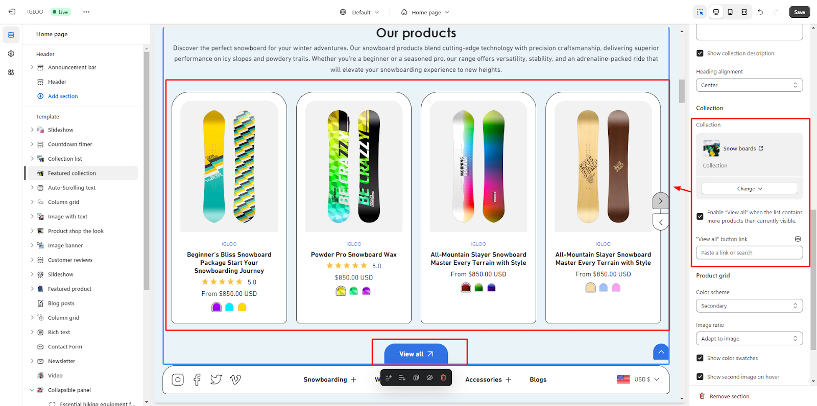
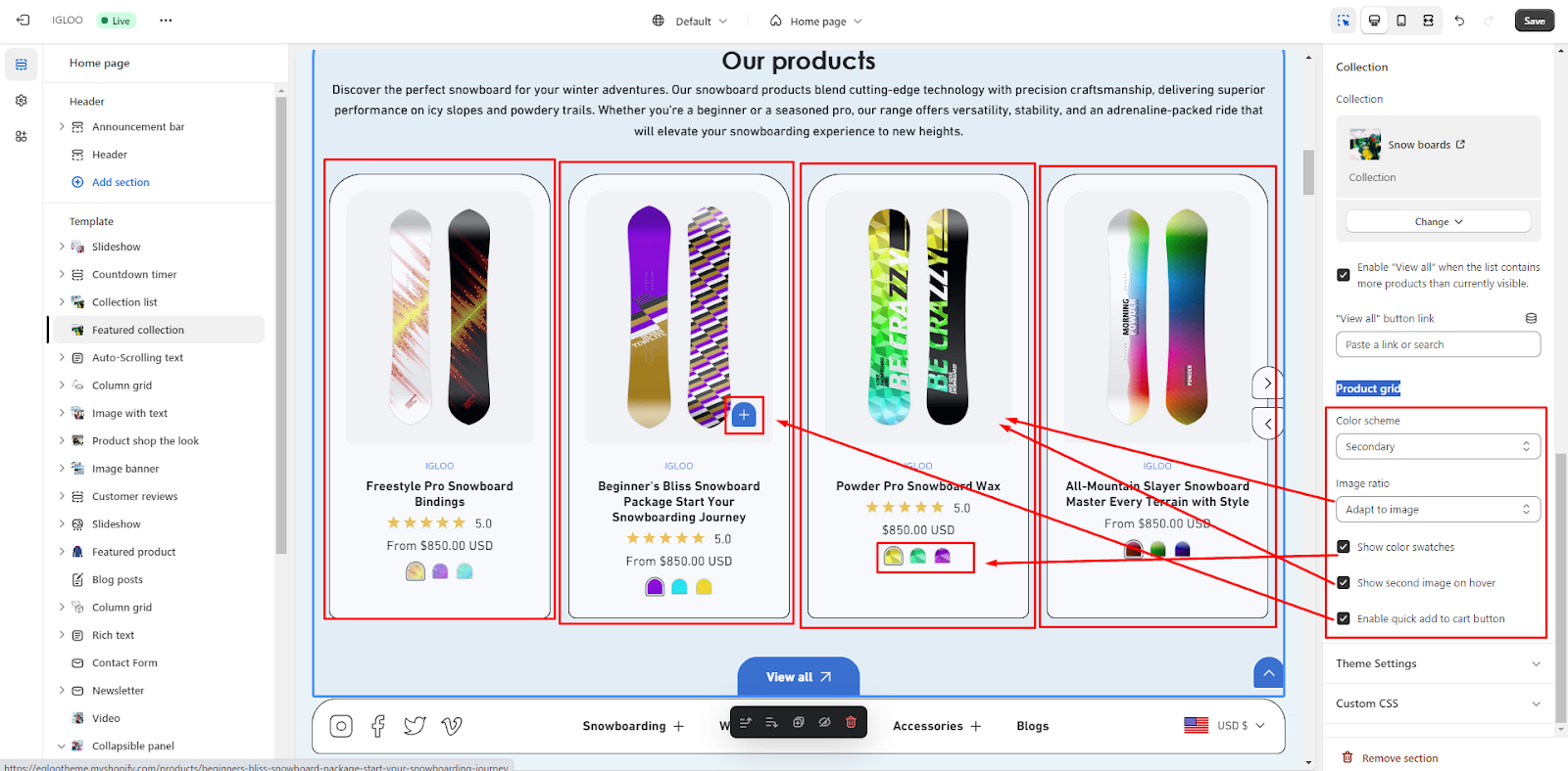
7. Next, the option to configure the settings of the product grid comes into focus. You can opt for a desired color scheme for the product grid and specify the preferred image ratio from the available options.
Beneath this, there are three checkboxes that control the following features:
- a. Display color swatches.
- b. Show a secondary image when hovering over a product.
- c. Enable a quick "Add to Cart" button.
By following these steps, you can comprehensively customize the presentation and functionality of the featured collection within the chosen template.
Unable to locate the information you need?
Our support team is here to help! Feel free to reach out anytime – we're just a message away and ready to assist you with any questions you may have.