Colors
1. Navigate to the designated section within the theme's settings where color configurations can be modified.
2. Choose the background color for the entire webpage. This will serve as the primary background theme.
For reference, please consult the screenshot below.

3. Configure the background color specifically for popups. These settings will define the secondary background theme used for popups.
Refer to the screenshot below.

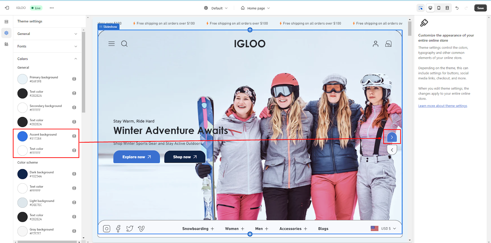
4. Tailor the background color associated with slider dots and arrows. This will establish the accent background theme for these elements.
Review the screenshot below for guidance.
Ensure that the selected colors resonate with your brand's identity, utilize the available color options to match your brand's aesthetics.
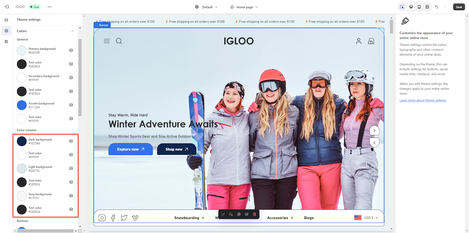
View the example section where the aforementioned color scheme modifications are visible. This provides you with an overview of how the changes will manifest on your website.
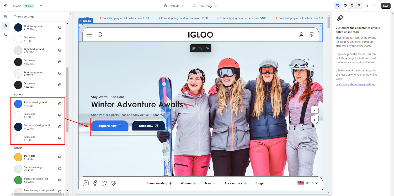
5. Explore the range of colors available for buttons. These options empower you to seamlessly integrate visually appealing buttons into your website's design.

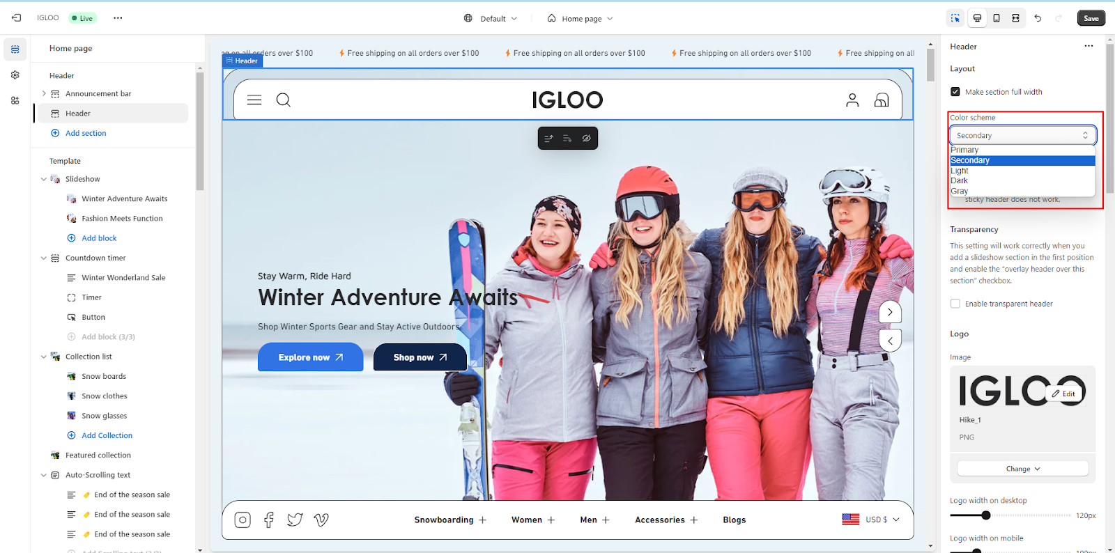
Discover supplementary color variations that can be employed as needed. These options cater to diverse design requirements, allowing you to maintain a consistent and aesthetically pleasing visual experience.
Unable to locate the information you need?
Our support team is here to help! Feel free to reach out anytime – we're just a message away and ready to assist you with any questions you may have.